Above, is the first of many 'Video blogs' that my group constructed together. The aim of this blog was to summarise what we had achieved so far in the process; we wanted to record some of our research and current ideas in a video, which allowed us to practice with the camera equipment as well as giving us a chance to practice with the 'Video editing machine' and 'Premier Pro' software. We also felt that a 'video blog' would give us a chance to explore documenting our findings on a different media platform, as opposed to simply writing up our process.
Friday 25 November 2011
Sunday 20 November 2011
Planning: Storyboards
Following conventions of the media industry, we constructed storyboards for our music video. This planning process was essential as it helped lessen the potential for mistakes and errors that we could make when filming; storyboarding first meant we know exactly what footage we wanted to capture on the day.
 |
| Storyboard 1 -3; establishing shot (band) > wide shot + slow reverse-zoom (band) > extreme close-up (band) |
 |
| Storyboard 4 -6; High-angle jib shot (band) > split-screen wide shot (narrative) > mid-shot (band) |
 |
| Designing storyboards! |
Friday 18 November 2011
Planning: Drafting Ancillary Task
Below, are some hand-drawn drafts for my ancillary task. Using my research, I took inspiration from existing media products during the designing process, and constructed the following drafts for a potential DVD Digipack.

(Front Cover) (Back Cover)

(Disc)
Wednesday 16 November 2011
Research: CD Design
Contents of a conventional CD


Conventional CD Cases with CD faces

Unconventional CD booklets - Poster

Unconventional CD booklets - Folding horizontally

Unconventional CD Cases - Slipcases

Tuesday 15 November 2011
Planning; Research: What is a Digipack?
For our ancillary task, we have to construct both a magazine advertisement and a CD digipack to promote our band. I was at first slightly unsure about what a digipack actually consists of, so I undertook some research to help construct my own. I discovered that in fact I had Digipacks in my own personal collection; different from the conventional JewelCase CD that the majority of CD's are housed in, a Digipack is a cardboard sleeve that can fold out into several panels. Usually, Digipacks are used to promote a Deluxe version of an album or for a live performance album - as these usually include an extra disc such as a video of the performance on DVD - a Digipack is probably more appropriate for a dual disc format than the standard JewelCase.
For research purposes, I photographed and then analysed some of the Digipacks that I had bought.

The six panel design of this digipack, when unfolded, shows one panel covered with a large image of the artist, the central panel holding the CD and the right-panel holding a booklet that includes lyrics, pictures and personnel included on the record.

A black and white colour scheme shows the artist name, album title and a picture that extends on to the back panel of the Digipack.

Opening the Digipack shows the inlay has the complete lyrics included on the album along with some small pictures of the band. The panels house a folded poster and the CD itself which is in a plastic case. I thought the use of including a poster within the Digipack was an important aspect as it showed how Media can cross platforms - the artist pictured above has a CD - audio Media, included alongside a poster - Print Media. Both of these carry some similar motifs to show their relation; the poster would include the same typography of that seen on the CD cover for example - whilst the poster would also have an image of Bruce Springsteen shown; the audio will have Springsteen himself singing - Springsteen therefore the motif across media platforms.

A black and white design featuring only the name of the artist - almost an enigma code in itself, in that it is a slightly mysterious picture with simply just a name; this is recognised by the distributor as a sticker containing more information has been plastered on to the top left corner.

An extremely simple design; no pictures, no colours - except black and white - and only the name of the artist on the disc. This design would suggest it's for a mature audience; as someone who has listened to the CD, it could also suggest that the music itself and its subsequent themes have a dark quality about them.

Two different Gatefold packs; a strong image plastered across the inside of the pack with a the CD housed in one of the panels while a booklet containing lyrics and pictures is in the other.

Two different live album digipacks - I used both of these as I felt they contrasted each other; the top digipack is by the alternative band 'Eels', aimed at a mature audience whilst the digipack below it is by the rock band 'My Chemical Romance' - a band aimed at the teenage demographic - similar to our chosen band 'Paramore'.

Opening up both the Digipacks shows how the target audience can influence the design; the 'Eels' have opted for a simple, black colour scheme with one panel detailing the track listing, one including the personnel responsible for making the record possible and the final panel housing the CD. The design on the CD itself is again, simple - a small picture of the lead singer with the header beside it. Small pictures can also be seen on the panels, but are not the main focus of the design, rather more for decoration purposes. In contrast, the digipack below it, 'My Chemical Romance's live album, includes a booklet full of pictures of the band on and off stage. The CD and DVD design feature intricate drawings that reflect the style seen on the bands touring theme, while the panels are all decorated with a background picture of the crowd at the gig featured on the DVD.
For research purposes, I photographed and then analysed some of the Digipacks that I had bought.

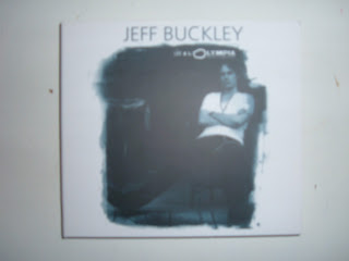
A simple dual colour scheme of a dark shade of blue and white, with the artists name and title of the live album - with the main image a picture of the artist himself.

The six panel design of this digipack, when unfolded, shows one panel covered with a large image of the artist, the central panel holding the CD and the right-panel holding a booklet that includes lyrics, pictures and personnel included on the record.

A black and white colour scheme shows the artist name, album title and a picture that extends on to the back panel of the Digipack.

Opening the Digipack shows the inlay has the complete lyrics included on the album along with some small pictures of the band. The panels house a folded poster and the CD itself which is in a plastic case. I thought the use of including a poster within the Digipack was an important aspect as it showed how Media can cross platforms - the artist pictured above has a CD - audio Media, included alongside a poster - Print Media. Both of these carry some similar motifs to show their relation; the poster would include the same typography of that seen on the CD cover for example - whilst the poster would also have an image of Bruce Springsteen shown; the audio will have Springsteen himself singing - Springsteen therefore the motif across media platforms.

A black and white design featuring only the name of the artist - almost an enigma code in itself, in that it is a slightly mysterious picture with simply just a name; this is recognised by the distributor as a sticker containing more information has been plastered on to the top left corner.

An extremely simple design; no pictures, no colours - except black and white - and only the name of the artist on the disc. This design would suggest it's for a mature audience; as someone who has listened to the CD, it could also suggest that the music itself and its subsequent themes have a dark quality about them.

Two different Gatefold packs; a strong image plastered across the inside of the pack with a the CD housed in one of the panels while a booklet containing lyrics and pictures is in the other.

Two different live album digipacks - I used both of these as I felt they contrasted each other; the top digipack is by the alternative band 'Eels', aimed at a mature audience whilst the digipack below it is by the rock band 'My Chemical Romance' - a band aimed at the teenage demographic - similar to our chosen band 'Paramore'.

Opening up both the Digipacks shows how the target audience can influence the design; the 'Eels' have opted for a simple, black colour scheme with one panel detailing the track listing, one including the personnel responsible for making the record possible and the final panel housing the CD. The design on the CD itself is again, simple - a small picture of the lead singer with the header beside it. Small pictures can also be seen on the panels, but are not the main focus of the design, rather more for decoration purposes. In contrast, the digipack below it, 'My Chemical Romance's live album, includes a booklet full of pictures of the band on and off stage. The CD and DVD design feature intricate drawings that reflect the style seen on the bands touring theme, while the panels are all decorated with a background picture of the crowd at the gig featured on the DVD.
Thursday 10 November 2011
Planning: Style Guide
To maintain a consistent 'house' style amongst all of my group's print-media ancillary tasks, we composed a style guide in which we could refer to when designing our individual tasks. This style guide ensured that we kept to the codes and conventions of a CD/DVD Digipack and Magazine advertisement - by keeping to consistent fonts, colour-schemes, and places of research.
Here was our shortlist for fonts; we decided on 'Orator Standard'.

Here is collection of record company logo's, colour-schemes and potential locations:


Sunday 6 November 2011
Development: Band Logo
To understand our logo as a media product/brand identity, I applied it to various surfaces to discover whether it would be flexible for purposes that it wasn't original intended for - indeed it was designed with computer-based programmes in mind; applying it to our band photo's and album artwork etc. However, I discovered our logo, one of our motifs, could be applied to different surfaces effectively.

Indeed, as the above image shows, the logo can be applied to wall-surfaces (top left and top right), fabric (bottom-left) and a jigsaw puzzle (bottom-right). This diversity of locations that the logo can effectively be plastered on lends endless possibilities for merchandise ideas and advertising prospects. For example, the logo's clear-visibility on fabric can inspire t-shirt designs; the wall designs show it's prospects for wall-art and artistic graffiti, whilst the logo's visual appeal on a more unconventional place that you'd expect to see a logo - the jigsaw - inspires the imagination for merchandise ideas such as the logo on badges, cups and more; this array of locations that the logo could potentially be seen increases the opportunity for the audience to be exposed to 'Paramore'.

Indeed, as the above image shows, the logo can be applied to wall-surfaces (top left and top right), fabric (bottom-left) and a jigsaw puzzle (bottom-right). This diversity of locations that the logo can effectively be plastered on lends endless possibilities for merchandise ideas and advertising prospects. For example, the logo's clear-visibility on fabric can inspire t-shirt designs; the wall designs show it's prospects for wall-art and artistic graffiti, whilst the logo's visual appeal on a more unconventional place that you'd expect to see a logo - the jigsaw - inspires the imagination for merchandise ideas such as the logo on badges, cups and more; this array of locations that the logo could potentially be seen increases the opportunity for the audience to be exposed to 'Paramore'.
Friday 4 November 2011
Planning: Band Logo
To ensure that we chose the best result, much experimentation went into the final design; to achieve the final logo we had to redesign it several times to explore whether or not it could improve. Below is a selection of colour schemes we tested on our logo to see which one we liked best; the colour scheme would prove to be an integral part of our project as it would be implemented into all of our designs - a recurring motif that would make our brand instantly recognisable for the audience.


Thursday 3 November 2011
Development: Band Logo
Above is our final logo for our band; it's important to follow the conventions of existing print-media and use a single logo - the re-occurrence of which will become familiar to the audience, a motif of the band.
Tuesday 1 November 2011
Research: Existing Band Brands and Logos
To examine the codes and conventions of existing band logo's and brands, I photographed conventional merchandise of the rock genre - gathering images of existing media products such as patches and badges. This research helped inspire my designing process when approaching my ancillary tasks.

(Above and below) Band 'patches'

(Below) Band badges

Subscribe to:
Posts (Atom)